HMV Central

A different approach was adopted for HMV’s second store opening, choosing a color palette of blond wood and extreme repetition of a wall bay design and exposed tube-lighting to create an expansive retail space with a fresh, clean and contemporary character.


An iconic service counter with neon signage is the landmark in this shopping square. Directory signage, visual merchandising tools, and modular furniture is all designed to easily modify setups to adapt to changing needs.

Habitū All Day

Three Dogs worked closely with caffè HABITŪ to renew the retail image of Hong Kong’s premier homegrown coffee shop brand.

We retained key brand elements such as the warm yellow color and black and white floor tiles and at the same time reorganised and tidied up counter design to incorporate all signs, displays, promotional materials and service points into one coherent design. A custom designed tile pattern makes the bar as a focal point. Together with a new furniture selection, efficient layout, and an internally illuminated boundary, this creates a smart new image that carries the brand into the future.

HMV Emporium

This entertainment emporium occupies the three top floors of the Pearl City Mall in Causeway Bay. The building structure is typical for shopping malls of the seventies: low ceilings and deep floor plates with little natural light.


The client brief asked for an extremely short design and construction period, a layout that offered flexibility to adapt to changing needs, a way to bring more light and space to each floor and a raw and ready-made aesthetic.


The solution was the construction of a new atrium, visually connecting the three floors. This was combined with an interior design scheme that left most of the original building structure untouched. It was simply cleaned, sealed and left exposed. Building services were carefully designed so they could be left exposed too and contribute to the aesthetic.


Brick partitions and a couple of design ‘events’ such as signage, cashiers, bars and Dj booths were strategically placed throughout the space to create focal points and guide the visitors. A lighting system was installed to enhance this experience. Level 1 contains music a movie collection, level 2 contains lifestyle and audio products and level 3 a bar, restaurant, and music stage and a small retail area.


Habitū Caffè

Three Dogs worked closely with HABITŪ caffè in a couple of years. By renewing the retail store image, a naming of “HABITŪ” successfully being a popular homegrown coffee chain in Hong Kong nowadays.


We retained key brand elements such as the warm yellow color and black and white floor tiles and at the same time reorganised and tidied up counter design to incorporate all signs, displays, promotional materials and service points into one coherent design. A custom designed tile pattern makes the bar as a focal point. Together with a new furniture selection, efficient layout, and an internally illuminated boundary, this creates a smart new image that carries the brand into the future.

MBT

The ‘sensor’, MBT’s logo form, sits inside the sole of each MBT shoe. It was only natural to use it as the basis of MBT’s retail design.


Sensor shaped stackable shelving can be chain linked to adjusting to any site condition. Height adjustable tables and wall panels have sensor shaped perforations. These visually striking elements, combined with the strong red-white color scheme delineating casual and sports products, created a strong retail presence. The design was prototyped and manufactured in China and rolled out in stores worldwide.

Wild Bounty

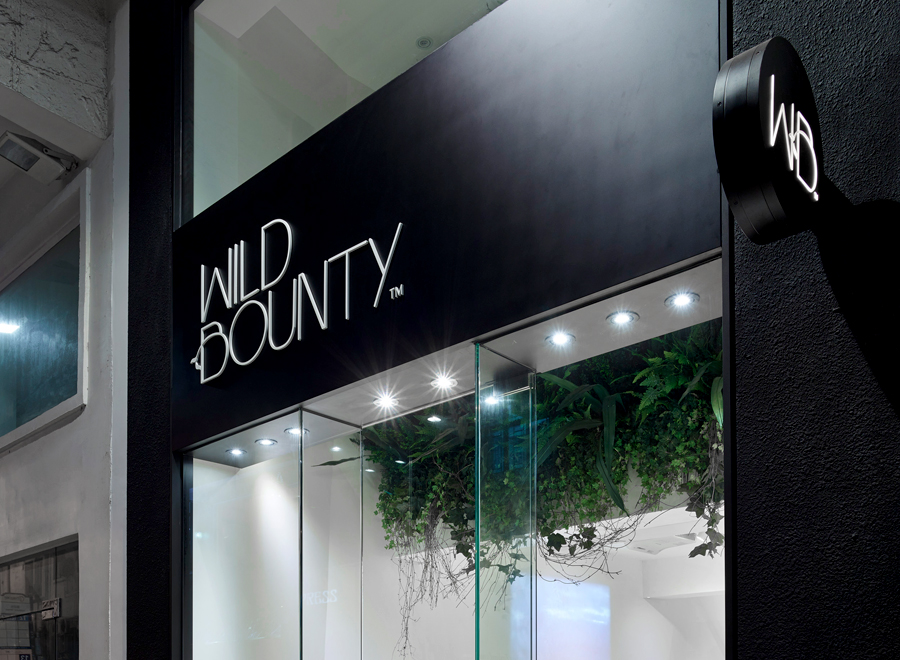
The store design is based on the idea of expressing the power harnessed in New Zealand natural environment.


Cues from the brands’ packaging design, a controlled palette of materials and forms are combined into a distinctive retail experience that elevates the products. A large plant wall creates a striking shopfront image, while inside long tiered solid wood display shelves stand out against the subtly angled lines of the perimeter walls and the soft tones of the terrazzo flooring.


A lot of care was put into designing the product presentation. A selection of display and tester trays, graphic displays and visual merchandising guidelines make the product range very accessible. Cork display columns with plated steel inserts showcase key offers. A graphic wall with a striking three-dimensional treatment acts as a background for the cork-and-glass service counter. Playful details such as the handles and railings, display tools and the yellow gridlines that lead the first-floor treatment room complement the experience.

Lee Jeans

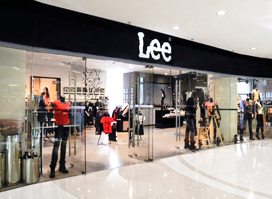
Three Dogs/ Retail design developed a store concept based on the black and white of the Lee logo and the industrial/chic brand positioning.


The concept stores consist of a black men’s department, a white women’s department and a glass pavilion with imported premium denim. Products are displayed on a combination of specially designed furniture and found objects, including furniture consisting of bases of industrial machinery.


This resulted in an exciting, vibrant shopping environment that managed to introduce the brand to a younger audience. The concept was rolled out in dozens of concept stores and in a modified version in hundreds of shop-in-shops.

Leluxe Teas

Leluxe brings top quality European teas and tea accessories to the China market.

The retail identity is a contemporary interpretation of European tea culture: attractive, sophisticated and accessible to a young audience.

The defining elements are the signature wallpaper and the iconic tea bar and tea wall. A simple but effective shelf system and visual merchandising standard present product in a clear, attractive manner. The same fixture modules can be used to build kiosk, shop-in-shop or stand-alone store setups.